Art Direction for Illustrations
In 2022, the Calendly content team decided they wanted to redesign the illustrations style used on the blog at the time. The team was finding that compared to what was in the market, the current illustration style was starting to feel outdated and needed to be refreshed. I was tasked with developing the new style for the illustrations and sourcing illustrators who could create new art for our highest performing blog articles.
Illustrator credits: 1st row (left to right): Aleksandra Dontsova, Julia Hanke, Natalia Watanabe. 2nd row (left to right): Gustavo Pedrosa, Lilit Martirosyan, Julia Hanke. 3rd row (left to right): Gustavo Pedrosa, Aleksandra Dontsova, Julia Hanke. 4th row: Julia Hanke, Lilt Martirosyan, Julia Hanke.
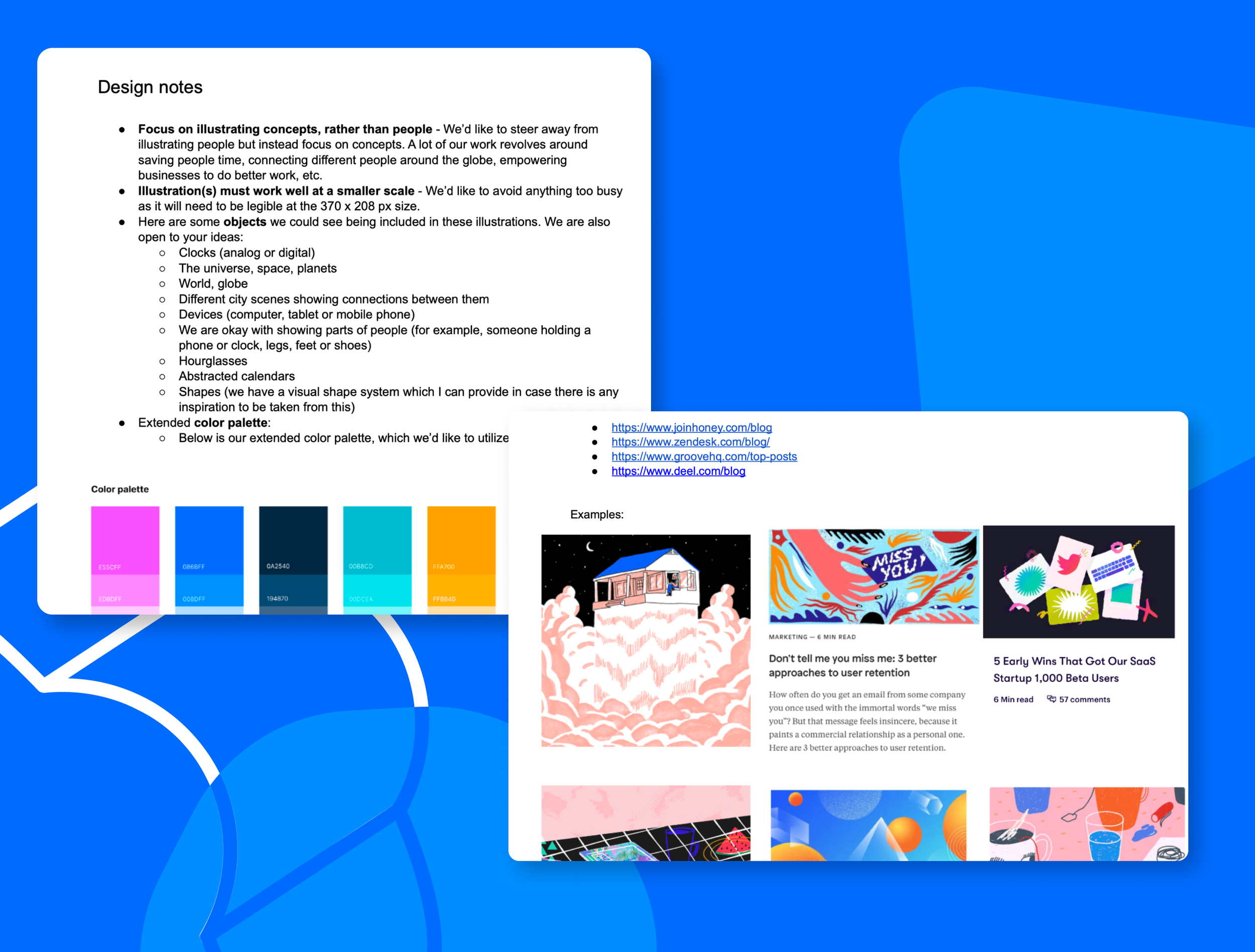
We had a series of meetings where we collected inspiration and developed guidance around what we wanted our illustrations to look like. Some of of the defining characteristics are below:
Focus on illustrating concepts rather than people. We found that illustrations of people were becoming oversaturated in the SaaS space and a lot of the styles tended to be fleeting.
Use objects as symbolism. We defined a series of icons and symbols that were related to our product.
Stick to a defined color palette. We developed a refined color palette that was slightly less extensive than our primary palette so that all the illustrations would feel like a cohesive unit even if different illustrators were creating them.
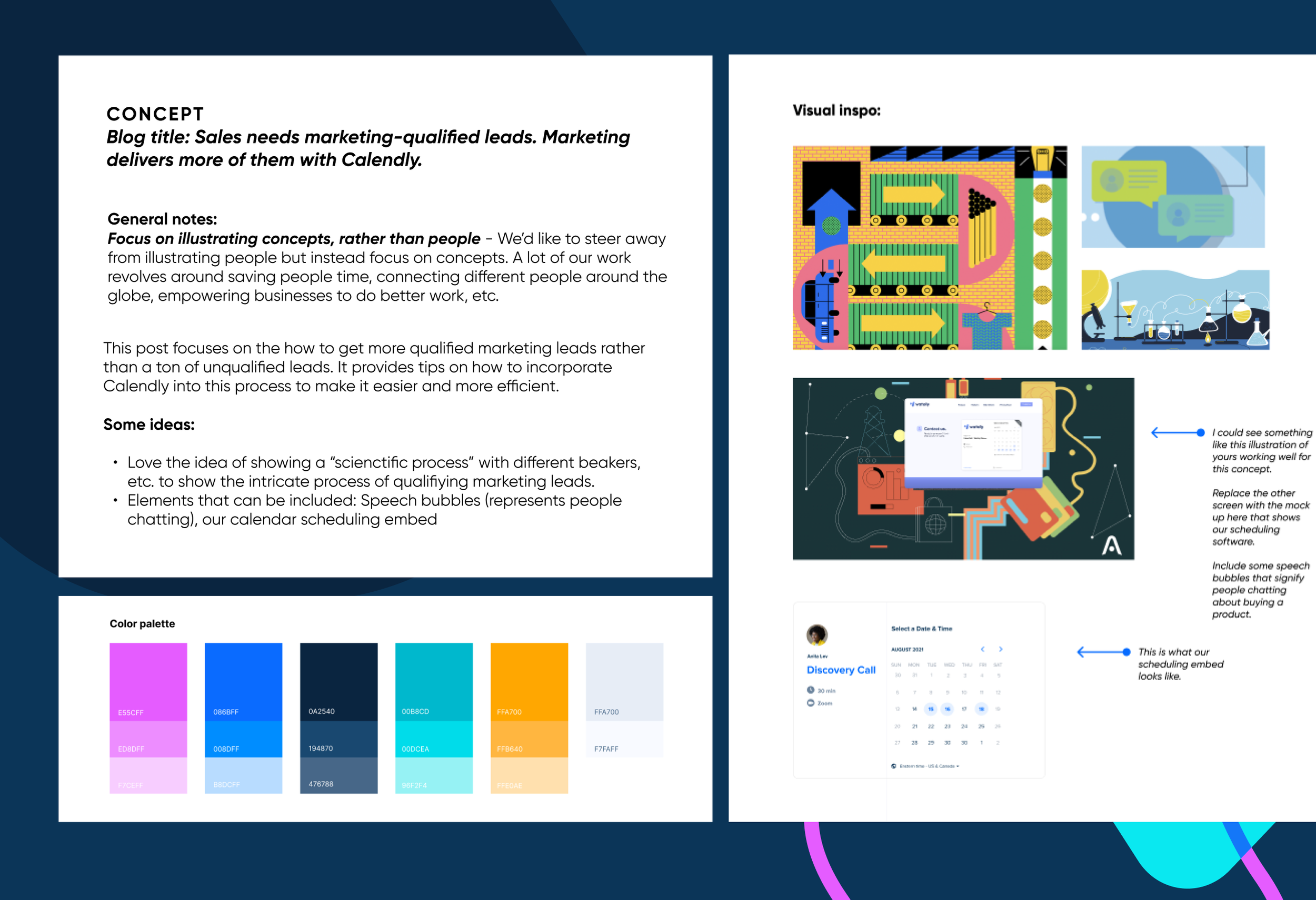
Once I developed the style guidance for illustrations, I moved onto sourcing illustrators who I felt would adapt to our style well while still bringing their own creative touch. After procuring the illustrators, I developed a series of creative briefs specific to each blog article with a summary of key points to highlight and examples of illustrations for inspiration.
More Projects
Hubspot Inbound Booth


